Interactivity
Field Sense
If you are a in a product organization and leading a team, a project, a program, or a division, you are playing the product game. You may not need to engage with this game if your scope is limited to technical expertise, or your footprint of formal authority exceeds your organizational awareness. Most people in product organizations leave the former condition within a year or two of work; my rude awakening is recounted as the opening of the Researcher's Journey. Only a few are cursed ȁ
Rethinking Figma, the cost of low taste, your banking app is lying to you
Weekly curated resources for designers — thinkers and makers.“For more than a decade, Figma defined modern product design. It made collaboration effortless, turned design into a shared language, and became the default workspace for teams building software. But as AI reshapes how products are planned, prototyped, and shipped, the central question is the extent of Figma’s usefulness. Or rather, will the canvas remain at the centre of gravity, if at all?Unlike the previous conference, Config 2026 m
Can AI make OCD worse?
The hidden cost of always agreeable, always available chatbotsWhat I’m like at 2 a.m., spending hours rephrasing one tiny question for AI.I start researching this topic because of personal experience. As a diagnosed OCD patient, I have spent more nights than I’d like to admit staring at a chatbot, trying to get reassurance about the tiniest thing. (Is this little bump a sign of a tumor? I felt a small bump on my way home, how do I know I didn’t hit someone?) The same questions are rephrased agai
Japan Doesn’t Design With Less. It Designs With Ma.
Why global design inherited the wrong framework for reading Japanese aesthetics.Continue reading on UX Collective »
When the profession outruns the mentor
AI is redefining work faster than experience can be passed on.Image source: Getty ImagesMentorship has traditionally depended on mentors having experience that mentees have not yet had the opportunity to acquire. But what happens when the profession changes faster than experience can accumulate?I’ve spent most of my professional life on both sides of mentorship. Early in my career, I benefited from mentors who patiently helped me develop as a designer. As my career progressed into design leaders
What are hypertokens? The layer between tokens and components, rebuilt for agents
A concept on the horizon, exploredA token holds a single decision. A component is a whole assembly. The interesting work lives in the gap between them, and people have worked that gap for years under different names. What it never had was one shared definition that every tool could build from.That gap used to be harmless. “The heading” might live in your CSS, your Figma file, and iOS, drifting slightly out of sync, and a designer just smoothed it over by eye. But it’s often an agent reading your
Pixels of the Week – June 28, 2026
This week we covers 2FA accessibility failures and why AI replicates but can't innovate. Also don't miss: what your browser tracks without asking, a beautiful Artemis II photo timeline and pixel cat companions for your dock.
The bullshit asymmetry principle was survivable. AI made production of slop almost free.
The press never tires. The inspector does. AI assisted.It costs ten times more to refute than making it. Generative AI drove the cost of making to zero. The fix is a design problem, not a fact-checking race.In 2013 an Italian programmer named Alberto Brandolini watched a political talk show and posted a single sentence that has outlived almost everything else he said that year.The amount of energy needed to refute bullshit is an order of magnitude bigger than to produce it.Alberto Brandolini is
Good designers, bad websites: a proposal
I want to discuss accessibility because it is the most important thing for making websites. Other A List Apart articles give you innovation and insight. This article will give you homework. These are just my personal views, but they’re pretty good.I want to start off with a couple of statements, and you will agree:Designers are good people. I have never heard a designer say, “I don’t care if somebody can’t read this text”, “Not my fault if somebody can’t use this device”, or “Who cares if this i
Show HN: Subatix – your local-first consulting team in an AI-workspace
Hello HN!We, a team of 2, built Subatix after one of us spent almost 6 years in big consulting and at certain point came to a thought like «90% of what consulting is usually data-analysis related, why not make smth so any business get same level of insights without externals and 6-figure+ checks and fast?!». Based the experience during every project everyone wants - fast answers from their data, but real ops/business data is messy, sensitive, and hard to outsource to generic AI tools due to
Why your Claude Code needs a design stack
The setup that makes Claude Code fit into your designer workflowContinue reading on UX Collective »
Discovery is a capability, not a phase
The judgment most discovery practice leaves undevelopedImage created by Author using DALL-E 3You can measure what happened after you released it. What most product discovery practice never examines, and has no frame for examining, is whether the human reasoning that produced it was sound.AI is compressing the distance between idea and delivery faster than ever. For many makers, that compression is bypassing deliberate discovery entirely. A prototype stands in for the problem framing, a rapid rel
The boundary between philosophy and design: Leveraging pure thought
Following the line from Plato’s Forms to the iPod, and what it reveals about where great design actually begins.Continue reading on UX Collective »
Externalization: 4 Ways and Methods to Uncover Your Tacit Knowledge
[[video:95]]Have you ever struggled to explain something which you easily know how to do? Performing the action is so familiar, and yet so hard to put into words. Or perhaps you’ve experienced the opposite phenomenon: you sketch and write to make a design problem clear to yourself… and you end up with a crystal-clear description of a solution which you didn’t think you had the knowledge needed to come up with when you first started.Much of our own knowledge, and that of our clients and users, is
Someone designed this
Why bad UX is often a business decision, not a design failure.There’s a screen most people have seen at least once.You’re trying to cancel a subscription. You’ve made up your mind. You click the button that looks like it starts the process.And then something strange happens.The page that loads isn’t a cancellation form. It’s a full-screen gallery of everything you’re about to lose. Videos. Deals. Music. Free delivery. Presented in bright tiles, warm colours, friendly icons. A highlighted countdo
How to stop re-explaining yourself to Claude
Claude doesn’t know who you are. Here’s how I fixed that.In March I switched from ChatGPT to Claude. The sessions were better, but for the first four to six weeks there was a tax I kept paying at the start of every new chat.I’d set up a Cowork project for each design stream I was working on. Each one had its own product context, team context, what I wanted from Claude as a collaborator. That helped. But session after session, I was still re-explaining things that had nothing to do with any speci
Rethinking Figma in an AI World
As AI pulls product development closer to code, Config 2026 reveals Figma’s high-stakes gamble to survive an era of agentic workflows in a code-native environmentAt Config 2026, Figma is responding to AI pressure by expanding its canvas into code layers, motion, and shaders to prevent teams from bypassing design handoffs entirely. The real test for the platform is no longer about competing with other design tools but proving that a canvas-first workflow can stay relevant in an AI era of code-fir
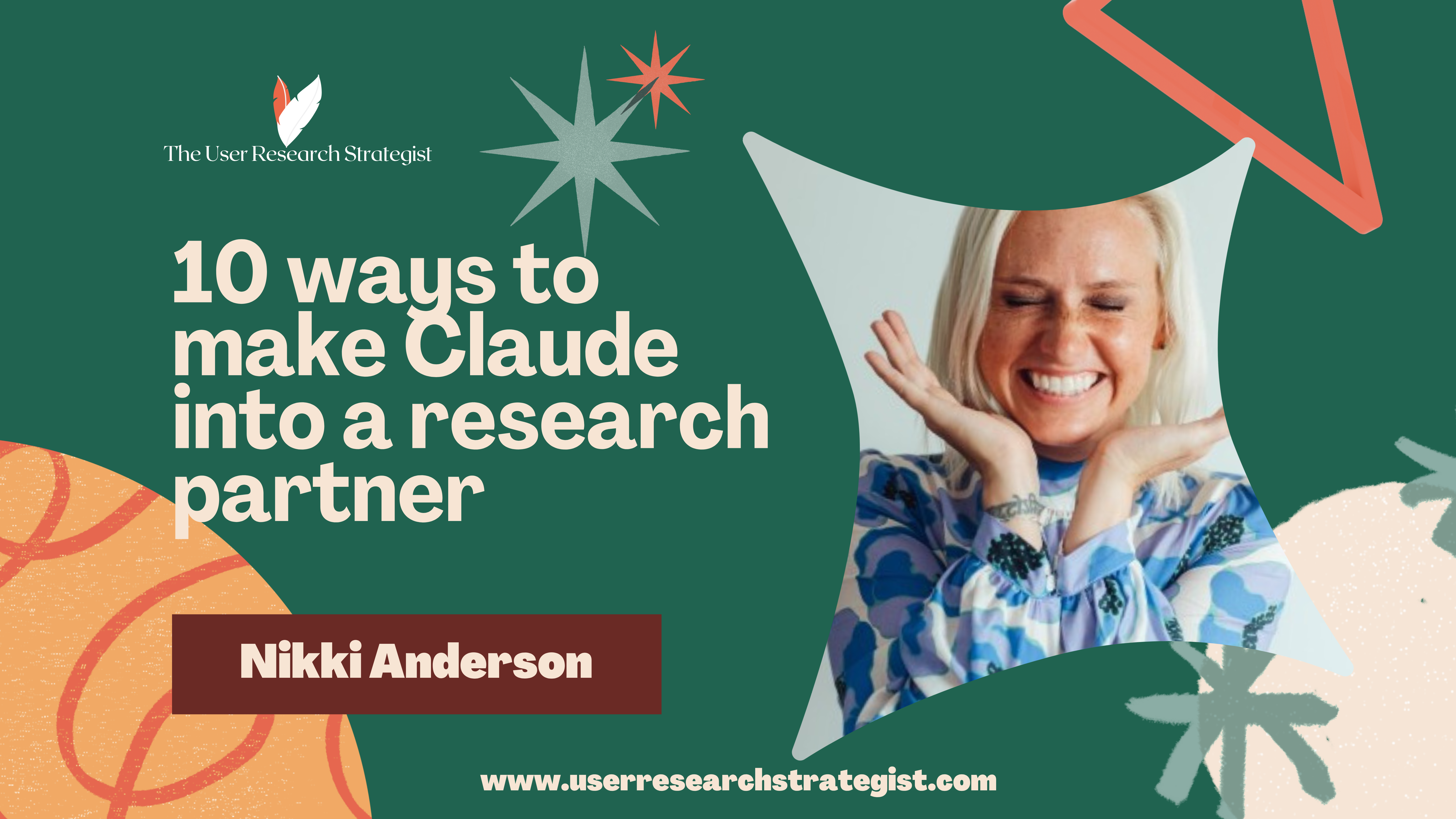
10 ways to make Claude think like a research partner (+ Free lesson sign-up)
I’m hosting a free 30-minute lesson on how Claude skills can be impactful and useful for user researchers on June 30th at 5:00pm BST (UK time). You’ll learn what skills are and how I apply them to my work. Recording will be sent out to all those who join (plus a discount code to my next workshop!).Join the free session!A few weeks ago, about thirty seconds before a discussion guide left my hands for a client, I typed three words into Claude, “red team this,” and it handed
Your design system runs on one person’s judgment-AI is about to prove it
Your design system runs on one person’s judgment — AI is about to prove it76 open contributions to IBM’s Carbon design system, each waiting to clear the same gate. Some have been here since April. The label says it plainly: “one more review.” Source: Carbon Design System on GitHub, captured June 2026.It is 6:40 on a Friday. Nine contributions are waiting for review, and every one of them is waiting on the same person.One changes a button’s hover state. One renames a token in a way that will brea
Transition into a UX Career: Top Insights
Today’s world relies on technology more than ever. Think about it: we use apps to order food, websites to book travel and smart devices to control our homes—and how we interact with these technologies has become a massive part of our daily lives. And the winds of change keep blowing as yet more sophisticated products continue to emerge to keep up with tech advancements and users’ expectations. User experience (UX) design is about creating technology that’s easy and enjoyable to use—and it’s the